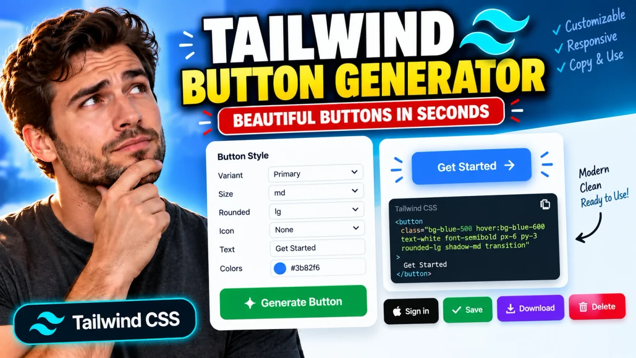
Tailwind Button Generator
TL;DR Summary
Tailwind Button Generator helps you create button markup styled with Tailwind CSS classes instead of building the button classes from scratch. Use the generated result as a starting point for your interface, and review the output before using it in production; the page does not provide a guarantee of accessibility, design accuracy, or project-specific compatibility, and its data-handling behavior is not specified in the supplied tool information.
About This Tool
Tailwind Button Generator is a browser-based utility for developers and designers who need to create buttons using Tailwind CSS utility classes. Instead of manually combining multiple utility classes for spacing, typography, colors, borders, rounded corners, and interactive states, you can use the generator to build a button and copy the resulting code into a website or application.
Tailwind CSS uses small utility classes to control the appearance of HTML elements. A single button can therefore contain several classes that define its padding, text size, background color, border radius, font weight, hover state, focus state, and other visual properties. Writing these classes by hand is flexible, but it can also take time when you are testing different button designs. A Tailwind Button Generator provides a more direct way to assemble this type of UI code.
The main use case is front-end development. Developers can use a generated button as a starting point for a page, dashboard, landing page, admin interface, SaaS product, or other web project that uses Tailwind CSS. Designers and learners can also use the output to understand how visual button properties map to Tailwind utility classes.
What You Enter and What You Get
The exact controls available on a particular generator interface determine which button properties can be customized. The core purpose, however, is to define a button's appearance and receive Tailwind CSS-based button code as the output. Typical button styling concepts include the button label, spacing, colors, text styling, border treatment, corner radius, and interactive states.
The generated result is useful because Tailwind classes are visible directly in the markup. You can inspect the classes, change them manually, and adapt the button to the rest of your application's design system. The output should be treated as editable source code rather than a final component that automatically fits every project.
How to Use
- Step 1: Open Tailwind Button Generator and review the available button controls.
- Step 2: Set the button properties you want, such as its label and available visual styling options.
- Step 3: Review the generated button preview or code and check that the result matches your intended design.
- Step 4: Copy the generated Tailwind CSS button code.
- Step 5: Paste the code into a Tailwind CSS project and adjust the classes or HTML as needed.
- Step 6: Test the button in your actual application, including hover, keyboard focus, mobile layouts, and different screen sizes.
Technical Explanation
Tailwind Button Generator is a code generator rather than a mathematical calculator, so there is no single numerical formula behind the output. Its basic logic is to translate selected button styling choices into HTML and Tailwind CSS utility classes.
For example, a button can use utility classes for padding, background color, text color, font weight, and rounded corners. A simplified Tailwind button might look like this:
<button class="px-4 py-2 font-medium rounded-lg bg-blue-600 text-white hover:bg-blue-700">
  Click me
</button>
In this example, px-4 and py-2 control horizontal and vertical padding, font-medium controls font weight, rounded-lg controls corner rounding, bg-blue-600 sets the background color, text-white sets the text color, and hover:bg-blue-700 changes the background when the pointer is over the button.
This example illustrates the general Tailwind approach. It should not be interpreted as the exact output of every version of the Toolhox generator. The generated classes depend on the controls and options actually available in the tool.
Preset Examples / Quick Reference
| Button Property | Typical Tailwind Concept | Purpose |
|---|---|---|
| Horizontal spacing | px-* |
Controls left and right padding. |
| Vertical spacing | py-* |
Controls top and bottom padding. |
| Background | bg-* |
Sets the button background. |
| Text color | text-* |
Controls text color. |
| Corner radius | rounded-* |
Controls how rounded the button corners are. |
| Hover state | hover:* |
Changes styling when the pointer is over the button. |
For example, if you want a simple blue button with white text and rounded corners, the generated code can follow the Tailwind pattern shown above. You can then change the class values to match your project's color palette, spacing scale, and component design.
Why Use This Tailwind Button Generator & How Our Generator Compares With Other Methods
The practical value of a button generator depends on what you need to accomplish. Manual coding gives you direct control, while a generator can reduce the amount of class composition you need to do yourself. Professional component libraries and design systems can provide additional project-level controls that a standalone generator may not cover.
| Method | Ease of Use | Calculation / Generation Speed | Best For | Limitations |
|---|---|---|---|---|
| Toolhox Tailwind Button Generator | Uses a dedicated interface to create button styling. | Generates the configured button output through the tool. | Developers who want Tailwind button code as a starting point. | Output still needs to be reviewed and adapted to the target project. |
| Manual Tailwind Coding | Requires knowledge of Tailwind utilities. | Depends on the developer. | Fully custom components and experienced Tailwind users. | Requires manually composing and testing utility classes. |
| Spreadsheet Calculation | Not a natural fit for UI code generation. | Not designed for this task. | Structured numerical or tabular work. | Does not provide a natural workflow for Tailwind button markup. |
| Professional UI / Component Software | Varies by product and workflow. | Depends on the software and project. | Large design systems and complex application interfaces. | Can involve more setup and project-specific configuration. |
Assumptions and Limitations
Tailwind Button Generator should be viewed as a code-generation aid. The generated button is not automatically guaranteed to meet the requirements of your application. You should check the HTML structure, Tailwind version, configured theme, color choices, responsive behavior, and interactive states before shipping the component.
Accessibility also requires more than visual styling. A button should have a meaningful accessible name, appropriate keyboard behavior, visible focus treatment, and sufficient contrast for its surrounding design. A generated visual style does not by itself prove that all accessibility requirements have been satisfied.
Compatibility is another important consideration. Tailwind configurations can differ between projects, and custom themes or utility settings may affect how generated classes behave. If a class does not exist in your project's configured Tailwind setup, replace it with an appropriate class or project-specific style.
The supplied tool information does not specify how user-entered information is processed, transmitted, or stored. Avoid entering sensitive or confidential information unless the page clearly explains its data-handling practices.
For production applications, treat generated code as a starting point. Test the final component in the real application rather than assuming that generated markup will work without modification.
Who Can Use Tailwind Button Generator?
The tool is useful for front-end developers, web designers, UI developers, students learning Tailwind CSS, and anyone who needs a Tailwind-based button without manually assembling every utility class. It can be particularly useful when experimenting with button styles or creating a quick starting point for a component.
If you already have an established design system, compare the generated classes with your project's existing component rules. Keeping buttons consistent across an application is usually more important than copying a generated style unchanged.